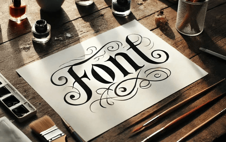
The only pillar of modern design and modern websites is typography. No matter which project type you are working on whether it is branding, website design, packaging, advertising, editorial work, or digital marketing, typography decides audience reaction. So it is clear audiences perceive information through your website typography.
If you are a designer you need to spend significant time selecting typefaces. Because it is the right approach. Many designers already use this strategy for finding the right font. It can improve your website reach.
You can find many free fonts that are available online.But professional designers frequently invest in premium options. It is because high-quality typography often provides better flexibility. As well as they provide stronger technical features, and greater originality.
Unique branding is the recognition of a professional designer and he can do that through premium fonts. That is why it has become a valuable investment rather than an unnecessary expense.
Due to this designers rely on commercial fonts because they offer licensing options. It avoids future copyright issues. Also these fonts have expanded character sets, and advanced features that support professional work.
This article tells you why designers continue investing in premium typography and what it provides.
The Growing Importance of Typography in Design
Typography has evolved beyond readability.
Today it influences:
- Brand identity
- User experience
- Visual hierarchy
- Marketing performance
- Accessibility
- Recognition
Modern audiences encounter typography everywhere.
Examples include:
- Websites
- Mobile applications
- Product packaging
- Advertisements
- Social media graphics
- Presentations
Typography often becomes one of the first elements users notice.
Because of this, designers treat font selection as a strategic decision.
Premium typography supports that process.
What Makes Premium Fonts Different?
Premium fonts usually provide more than visual appearance.
They often include advanced capabilities unavailable in many free alternatives.
Common features include:
Expanded Font Families
Premium collections may include:
- Multiple weights
- Condensed versions
- Extended widths
- Italics
- Variable styles
This flexibility improves design consistency.
Better Character Design
Letterforms are often refined carefully.
Spacing, alignment, and proportions receive greater attention.
Technical Optimization
Premium typography frequently includes:
- Better kerning
- Improved hinting
- Language support
- Responsive performance
These details improve overall quality.
Stronger Brand Differentiation
Brand identity depends heavily on uniqueness.
Using common fonts can make projects feel generic.
Professional designers often invest in premium typography because it helps brands stand apart.
Distinct typography creates:
- Recognition
- Personality
- Memorability
- Emotional impact
Many companies want exclusive visual systems.
Premium fonts provide more originality.
Creative teams frequently choose commercial fonts when building branding projects because they support long-term consistency and professional usage.
Typography becomes part of the identity itself.
Premium Fonts Improve Visual Consistency
Large projects require structured typography systems.
Brands often need typography across:
- Websites
- Packaging
- Print materials
- Social media
- Advertisements
- Product labels
Premium type families usually include extensive variations.
Designers can maintain consistency while adjusting:
- Weight
- Size
- Hierarchy
- Responsive layouts
This flexibility simplifies workflow.
Consistency strengthens branding.
Users recognize visual patterns more easily.
Better Readability Across Platforms
Typography performs differently depending on the environment.
A font that works in print may struggle on screens.
Professional designers test typography across:
- Desktop devices
- Mobile screens
- Tablets
- Large displays
Premium fonts often include optimization for digital use.
Benefits include:
Cleaner Letterforms
Characters remain distinguishable.
Improved Spacing
Reading becomes easier.
Better Rendering
Typography appears sharper.
Accessibility Support
Readable design improves usability.
Good typography reduces user friction.
Premium options frequently perform better in demanding environments.
Advanced Language and Character Support
Global brands often need multilingual typography.
Basic fonts may provide limited character coverage.
Premium typography usually supports:
- Extended Latin sets
- Special symbols
- International languages
- Currency signs
- Alternate glyphs
This flexibility is important for:
- International businesses
- Publishing
- Global campaigns
- E-commerce brands
Professional designers prefer systems that grow with projects.
Extended support reduces future limitations.
Licensing and Professional Usage Rights
Typography licensing matters.
Using fonts incorrectly may create legal issues.
Premium typography often includes clearer usage permissions.
Designers working with clients need licensing for:
- Commercial projects
- Advertising campaigns
- Websites
- Packaging
- Products
- Brand assets
Many studios invest in commercial fonts because licensing supports professional deployment.
This reduces uncertainty.
Clients gain more confidence in long-term use.
Legal clarity becomes part of the investment.
Premium Fonts Support Better Branding Systems
Brand systems require structure.
Typography often defines:
Headline Style
Primary message hierarchy.
Body Content
Reading comfort.
Accent Typography
Supporting visual identity.
Marketing Elements
Campaign consistency.
Premium collections frequently include multiple styles within the same family.
Designers maintain visual alignment without switching fonts.
This improves workflow efficiency.
Brands appear more organized.
See also: Affordable Business Class Flights to India with Premium Comfort
Greater Creative Flexibility
Design projects rarely remain static.
Clients request revisions.
Campaigns expand.
New materials appear.
Premium typography provides flexibility.
Designers can experiment with:
- Bold versions
- Thin weights
- Condensed layouts
- Variable systems
- Display styles
This versatility supports creativity.
One font family may cover multiple applications.
Teams avoid rebuilding systems repeatedly.
Premium assets save time.
Premium Fonts and User Experience
Typography directly influences user experience.
Poor text choices create friction.
Good typography improves:
- Reading speed
- Navigation
- Accessibility
- Engagement
- Retention
Premium fonts often include refinements that improve usability.
Examples include:
Better spacing.
Balanced proportions.
Optimized screen rendering.
Clear distinction between characters.
Users notice these improvements subconsciously.
The experience feels smoother.
The Role of Typography in Luxury Branding
Luxury brands pay close attention to typography.
Visual details influence perception.
Typography communicates:
- Elegance
- Heritage
- Sophistication
- Exclusivity
Premium fonts help support these qualities.
Luxury projects often avoid common free options.
Unique typography reinforces premium positioning.
Brand value increases through consistency.
Typography becomes a status element.
Professional designers understand this relationship.
Variable Fonts and Modern Typography Systems
Typography technology continues evolving.
Variable fonts are becoming increasingly important.
These systems allow designers to adjust:
- Weight
- Width
- Optical size
- Slant
Instead of loading multiple files, one system handles several variations.
Benefits include:
- Faster websites
- Better responsiveness
- Flexible branding
- Improved performance
Many premium collections include variable options.
This improves efficiency.
Designers gain more control.
Why Free Fonts Are Still Useful
Premium typography does not mean free fonts lack value.
Many free options perform extremely well.
They are suitable for:
- Personal projects
- Prototypes
- Small businesses
- Early design stages
However, premium fonts usually provide:
- More features
- Better licensing
- Expanded families
- Higher originality
Professional projects often require these advantages.
Designers choose based on needs.
Investment depends on project goals.
Common Reasons Designers Choose Premium Typography
Professional designers frequently invest because premium fonts offer:
- Greater uniqueness
- Better branding support
- Expanded language coverage
- Licensing clarity
- Responsive flexibility
- Higher visual quality
- Improved readability
- Long-term scalability
Typography becomes part of the design infrastructure.
Good font decisions support future growth.
Future Trends in Premium Typography
Typography continues evolving rapidly.
Emerging developments include:
Variable Font Expansion
Flexible systems becoming standard.
AI-Assisted Typography
Smarter recommendations.
Accessibility-Focused Design
Improved readability features.
Interactive Typography
Dynamic digital experiences.
Responsive Brand Systems
Adaptive visual identity.Premium typography will likely remain important as design expectations increase. And, creative professionals continue investing in quality.
Conclusion
Professional designers use premium fonts due to the impact that typography creates that goes beyond aesthetics.
Premium typography includes additional font families, advanced technological features, extended character sets, and better licensing options.
In situations where branding projects, websites, ads, and multinational companies are involved, it is usually worth paying for premium typography.
Design studios prefer commercial fonts since these fonts fit into professional practices and enable the necessary flexibility for complicated projects.
Typography stands out among other visual elements in design. Using top-quality typographic systems allows brands to convey their messages more effectively.